First of all, thanks so much for the enormous amount of love for my new powder room makeover! We are so happy to hear that you love it just as much as we do. While you are here, don’t forget to enter the awesome giveaway that Cutting Edge Stencils has made possible {giveaway ends Sunday at midnight}
Secondly, I showed some powder room pictures on Monday and I promised that I would be back today with even more pictures! More importantly, I am back with tips, tricks, and how to avoid silly mistakes during the stenciling process!
Stenciling has come a LONG way since my childhood in the 1980’s. Anyone have memories of their mothers stenciling floral borders on everything they could get their hands on? Yeah, it is definitely not the same, folks. Trust me.
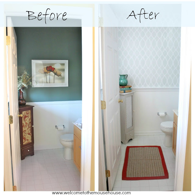
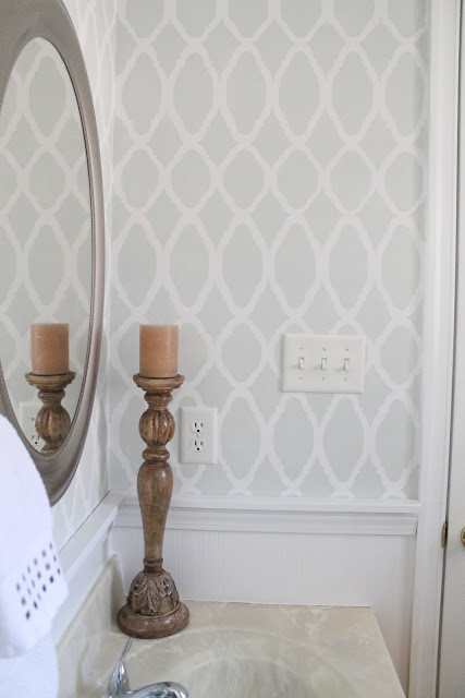
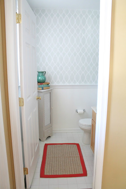
Our bathroom has literally been transformed with paint.
Keep in mind that we have not yet purchased new flooring or a new vanity (that will happen next year).
For under $100, we were able to change the look of the entire room with a few days worth of work.
Here are some before and afters:
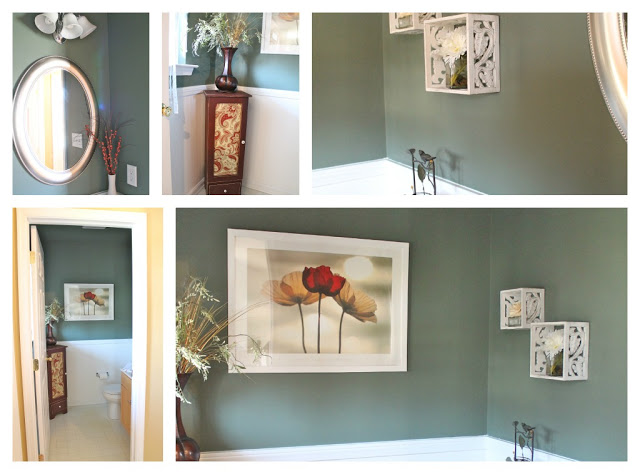
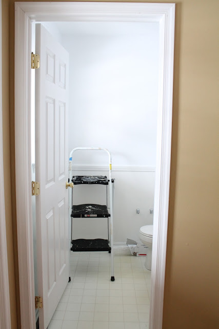
Dark and green.
We aren’t saying it was horrible, just definitely not our style.
This was exactly what the previous owners loved and we can appreciate that. Trust me, I have seen worse bathrooms.
Regardless, it just wasn’t our style.
Look at the difference some paint and hard work makes!
Seriously.
We don’t have a lot to spend {at all}. It is just part of life and we love a challenge. Working with what we have and seeing the potential in rooms is what we love. This powder room was no exception and we couldn’t be happier with the outcome.
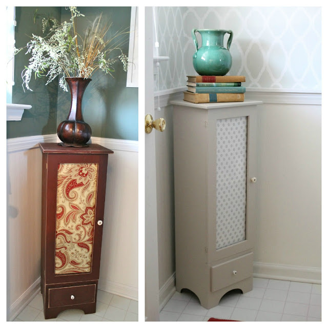
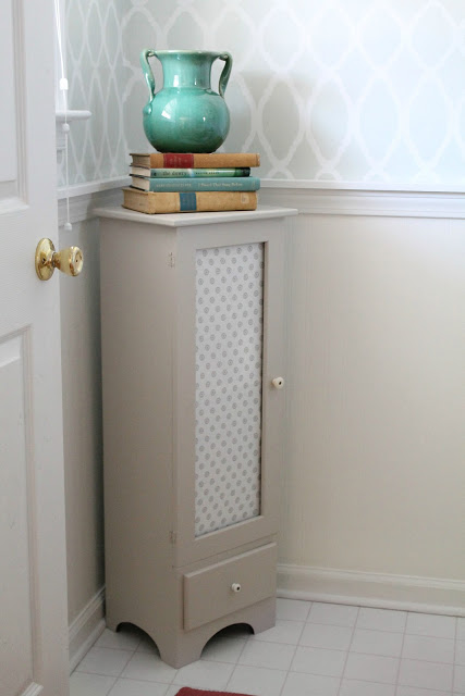
Not only did we repaint the walls and ceiling, but we also repainted that cute little cabinet {which just so happens to store our favorite magazines: Vegetarian Times, Better Homes and Gardens, and Ballard Designs Catalogs} And get this…. the paint used for the cabinet was sample paint that we had leftover from our recent paint choice debacle. Sharkey Gray (yep… we have finally chosen a color for the downstairs!) and I added a new fabric insert to freshen it up. Cute, right?
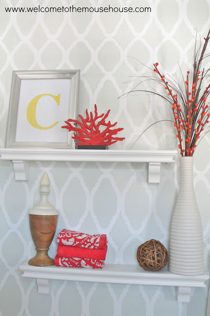
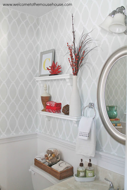
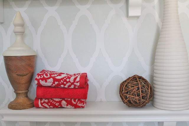
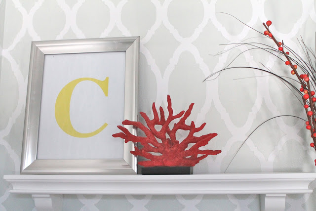
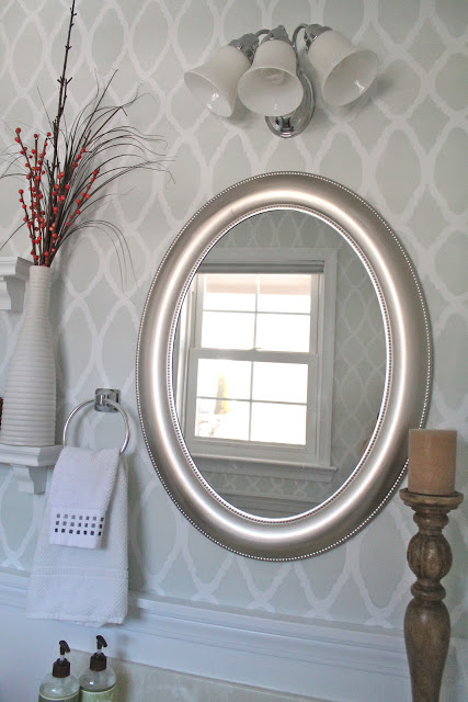
We also added some adorable white shelves above the potty, um I mean toilet. The shelves, towels, silver frame, and coral were from Target clearance {boo-ya!} The vase the right was from Ikea years ago and the wooden finial was purchased full price from Target’s evil end caps…. Damn you, you evil end caps full of amazing decor!
I plan to change out the silver frame often… just for fun.
Right now, it is a monogrammed letter that I simply printed out at home. I think I will do some fun pictures next time.
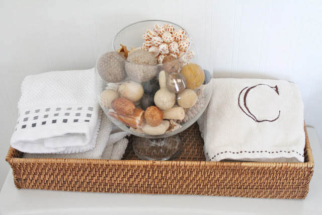
The wicker basket is from Target clearance (yeah, I go to Target way too much)…The glass vase and filler is from a craft store and the hand towels were gifts from people.
The previous owners actually had fantastic taste with some things! The mirror and light fixture were just fine, so we kept those.
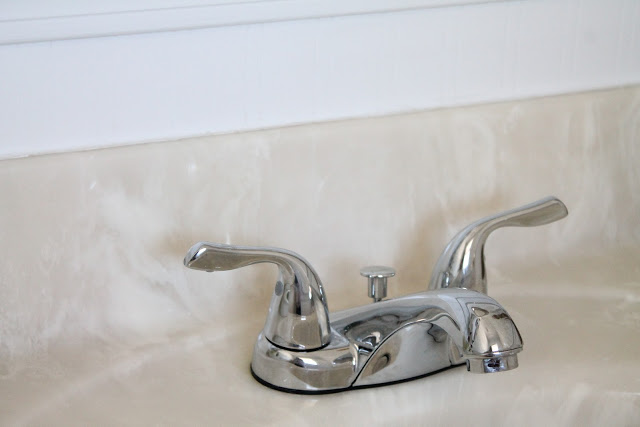
However, we did change out the faucet…
I don’t have pictures of the old one, but trust me when I say it was grody. We didn’t get anything fancy because we will be replacing the entire vanity soon.
Small changes like this can make a big difference.
Like I mentioned, we painted the side cabinet and added new fabric. On top is an old ceramic vase and some vintage books.
Free!
Okay, so let’s get to the nitty gritty of the paint job.
The undercoat was an eggshell white by Valspar. The topcoat (the part that was stenciled) was Sherwin Williams Sea Salt toned down by 25%. Basically, I poured 75% of the Sea Salt into a bucket and added 25% of the white undercoat to lighten it up to my desired color. Please don’t feel the need to do this. Sea Salt is a wonderful color. I am just crazy.
A flat paint or eggshell works best for stenciling. It allows for you to move quickly, but more importantly it reduces the amount of seepage and drips that might occur.
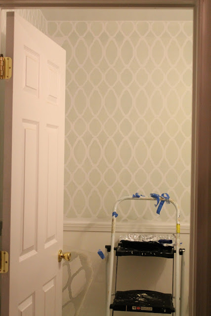
Here is my room, all primed and ready to go
So, you ready to begin?
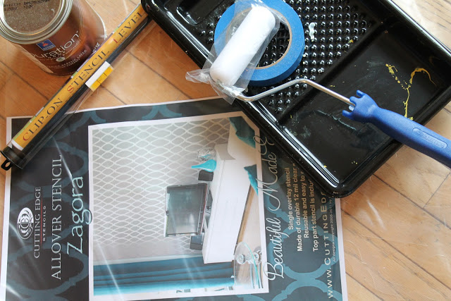
First, grab the necessary supplies:
*the stencil from Cutting Edge
*dense foam roller
*paint dish
*paint (eggshell or flat works best)
*Scotch Blue Painters Tape
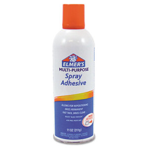
*Elmers Spray Adhesive
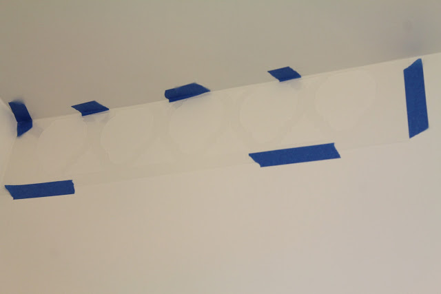
The best part about Cutting Edge Stencils is that they have now started including the border stencil in most of their kits! This is huge because you can get right up to the very top of the wall. It is best, in my opinion, to start with the upper part of the wall and work your way down. You can either lightly spray the back of your stencil with the spray adhesive or you can simply use blue painter’s tape to adhere it to the wall. Either method is effective, but I found the spray allowed for a more professional finish because it didn’t allow any paint seepage. If you choose to use the spray adhesive, you will need to reapply it almost every time.
When rolling on the paint, it is very important to use minimal paint. Get the paint onto your roller and then roll some of the excess off onto a paper towel. Start rolling on top of the stencil, making sure you cover every area as evenly as possible.
Don’t forget to check out the awesome video tutorials available on their website. These are an invaluable tool when starting out with a new stencil.
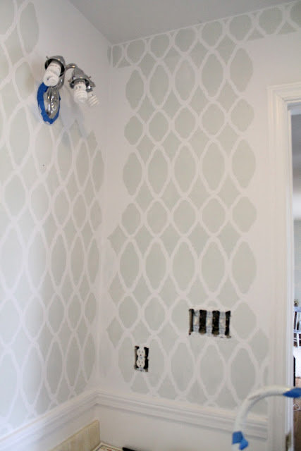
Once you have the first one down, move down and use the larger stencil and continue to do so until you have a column of your wall finished and then go right back up and start a new column… and continue going around the room in that fashion
Easy enough, right?
Well, remember when I said I would share some mistakes I made?
I didn’t forget that.
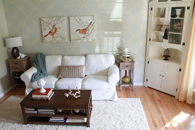
Let me explain…. when I did my living room accent wall, it was so super easy and took me about 6 hours
So, I figured my teeny tiny powder room would be the same.
Not so much.
I didn’t take all the angles, trims, window, door, light fixture, and walls into consideration during my initial thought process. I am not saying it can’t be done, because it obviously can, but it is most definitely more difficult than a straight wall.
So, what was my big mistake?
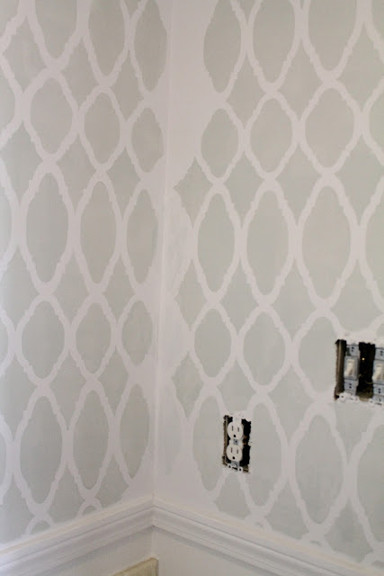
I was happily painting away, going around the walls in a clockwise fashion…. when I reached the end and realized I had made a huge mistake. There were two walls that were about to meet and totally didn’t match up. Ugh. If it was a hidden area, no big deal, but this was right at the sink where everyone would see.
As painful as it was, I knew I had to re prime the wall with the light switches. It was the only way to finish this project nicely. So, I re primed that wall and continued the stencil from the wall above the sink. Now, it all matched up perfectly.
I {finally} got to the end of my final wall and it didn’t meet up perfectly with where I started, but at least it was a hidden space.
This is very important…. pay attention to where you are starting and stopping if you are doing four walls. You will want it to be in an inconspicuous space. Trust me.
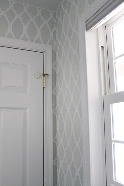
Here is my beginning and ending space. It doesn’t meet up perfectly, but it very hard to notice
One more final tip/trick that I have for you…
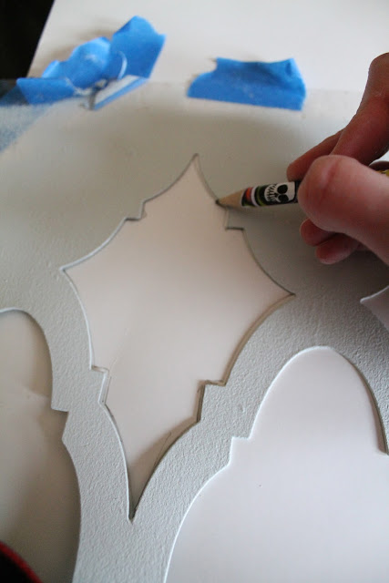
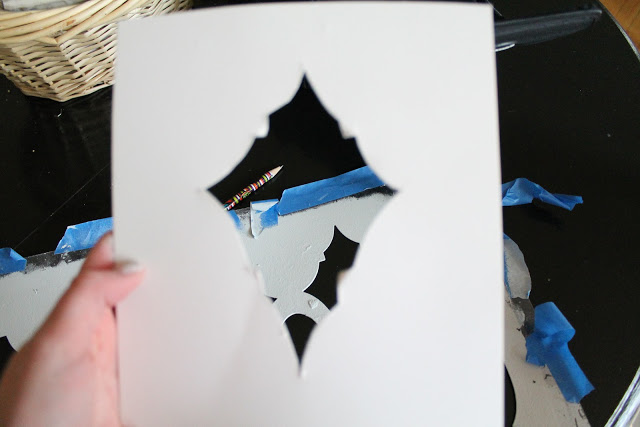
I had so many awkward spaces in this room and I found it really helpful to create some smaller stencils for small areas
I simply traced out the area onto cardstock
then I cut out the stencil
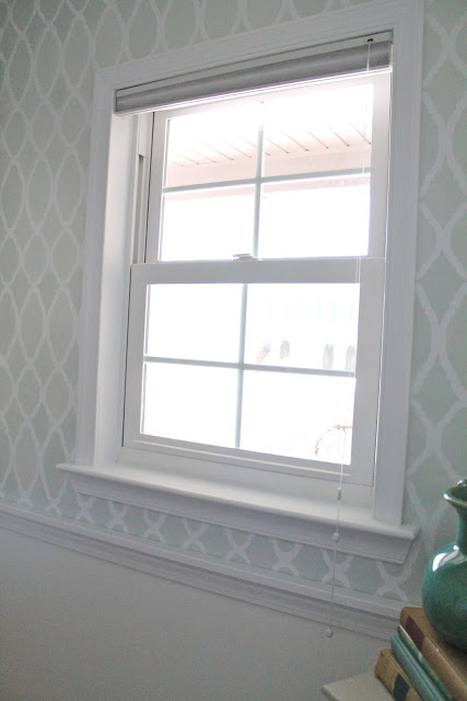
And used it in awkward places like the window area
I hope all of these tips/tricks and my mistakes will help all of you out when you do your first (or second) stenciling project.
Even though this room took a bit more time than I originally thought (because of my own silly mistakes), it was totally worth it in the end. Like I mentioned above, we don’t have a ton of money to spend and this was the perfect way to transform a space on a tight budget.
Hayley
Hayley Crouse is a wife, mother and multifaceted designer. Her love of sewing, crafting, cooking and interior design infuses her daily life and naturally spills over into her online presence. She pushes the envelope of her creativity and hopes that others will be inspired to do the same. She currently authors the Welcome to the Mouse House Blog, is the pattern designer behind Mouse House Creations and is a collaborative designer with Willow & Co. Patterns.
Latest posts by Hayley (see all)
- Music Room: Home Tour - January 11, 2019
- The Ace Cardigan - July 30, 2018
- Susie Halter Top and Shorts: Project Run and Play - July 18, 2018





I love it, so simply dramatic! 🙂 and where is the ‘mistake’? I love that you shared that you did make mistakes, I can’t see it now tho. 🙂
I really love this room. Your pattern choice for the stencil was a great one, as was the stencil for the living room. I’m just not as excited about the red& brown rug. Mb once you were able to turn the corner and see the coral/reds on the shelf it would look more, in tune?
Hi Hayley!
You did a great job with your bathroom makeover! I love it! I don´t like th rug too…. Can I make a suggestion? Why dont you keep you vanity and paint it to match the room?
Great makeovers!
Kisses from Portugal